Storm Warriors Media Foundation • NONPROFIT
Calling all who are Courageous
Storm Warriors Media Foundation is an organization that uses digital storytelling to help nonprofits and people in need. Still in its early stages but rapidly growing, SWMF needed a brand refresh that matched their position as thought leaders in the social sector.
Logo Design
• 
Branding
• 
Messaging
HERE’S THE LOWDOWN
Storm Warriors Media Foundation (formerly Storm Warriors International) is an organization dedicated to telling the stories of people and places in crisis in order to spread awareness and motivate people to take action. They accomplish this through offering free media services to nonprofits — such as video production and web design — which help amplify and spread these stories. We partnered with Storm Warriors for a full rebrand of their organization, which included a new color palette, logo, and messaging.
Establishing the Aesthetic
Every brand project starts with our design and copywriting teams getting a good grasp on our client’s visual identity. We call this the Discovery Phase, in which we show our client different elements of design — colors, typefaces, various kinds of imagery, etc. — in order to get a feel for their aesthetic preferences.
Going Back to Basics
When we begin the logo process, we go back to basics. Our design team first ideates with a good ol’ fashioned pencil and paper — this allows them to rapidly ideate a wide array of logo concepts — before hopping onto Adobe Illustrator to start digitizing and developing some of their top options.
The Final Four
With Storm Warriors, we focused on both nautical imagery and imagery associated with film production. We presented four finalists, each one a modern take on SW that could work across multiple digital platforms. We like to make sure we present four options that represent four different directions the brand could take, so the client can imagine the breadth of possibility.
Making the Messaging

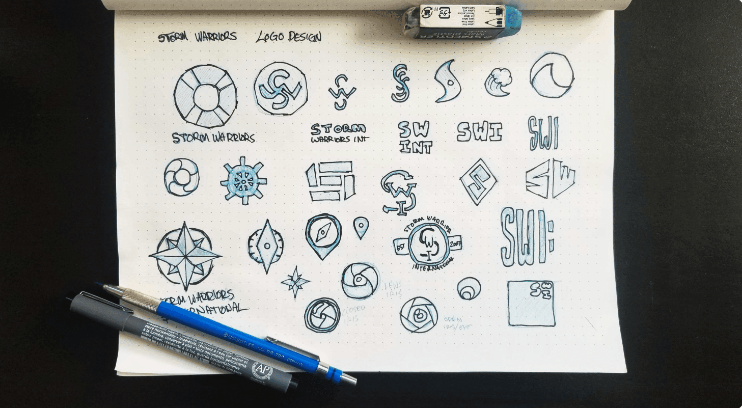
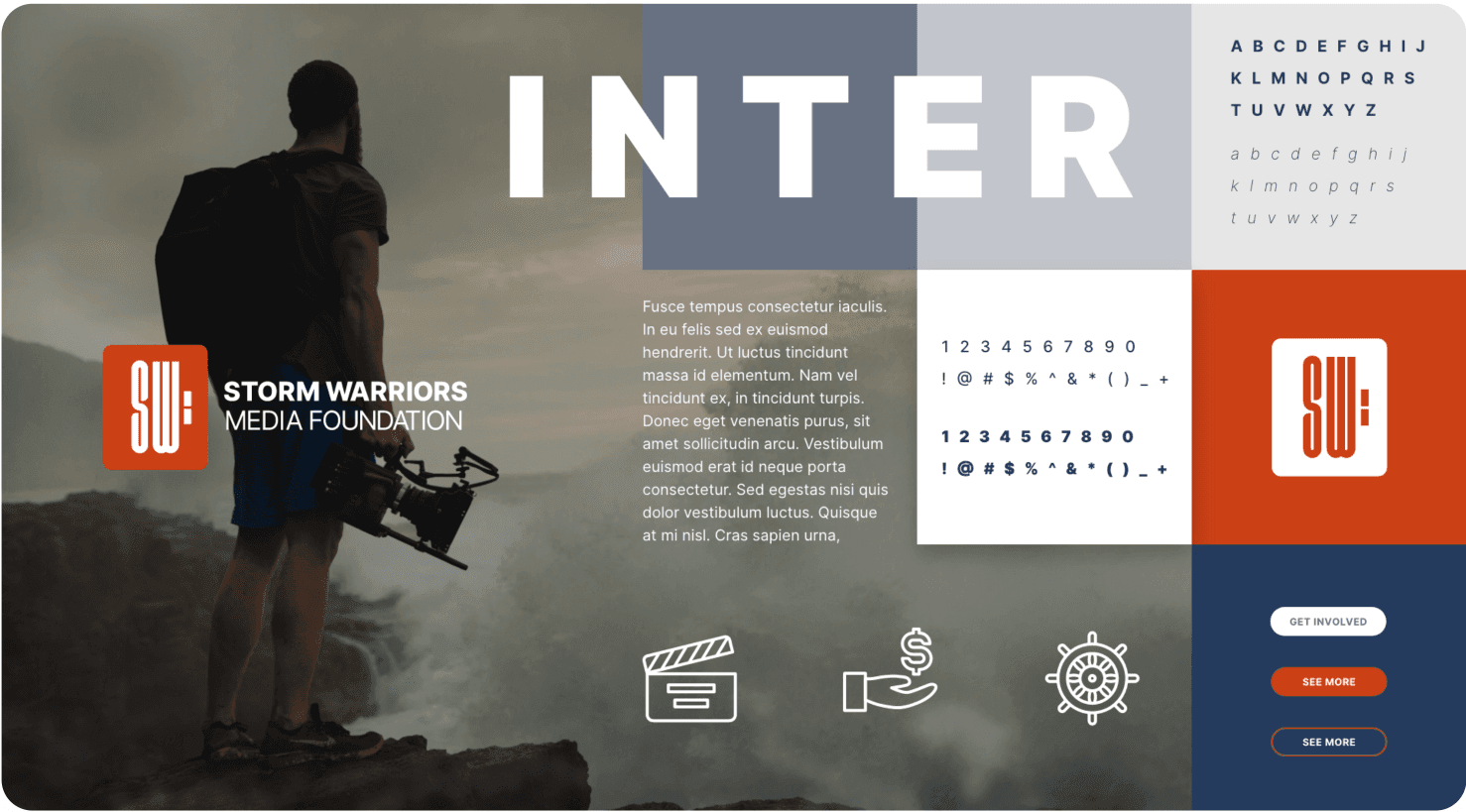
At the same time our design team is working on logos, our content team is fleshing out messaging, using the information we gathered during Discovery to nail down clean, concise lines of text that can be used in conjunction with the brand. Copywriters drafted up our client’s key features, a benefit statement, and finally a value proposition that can double as a tagline.

Finding the Final Form

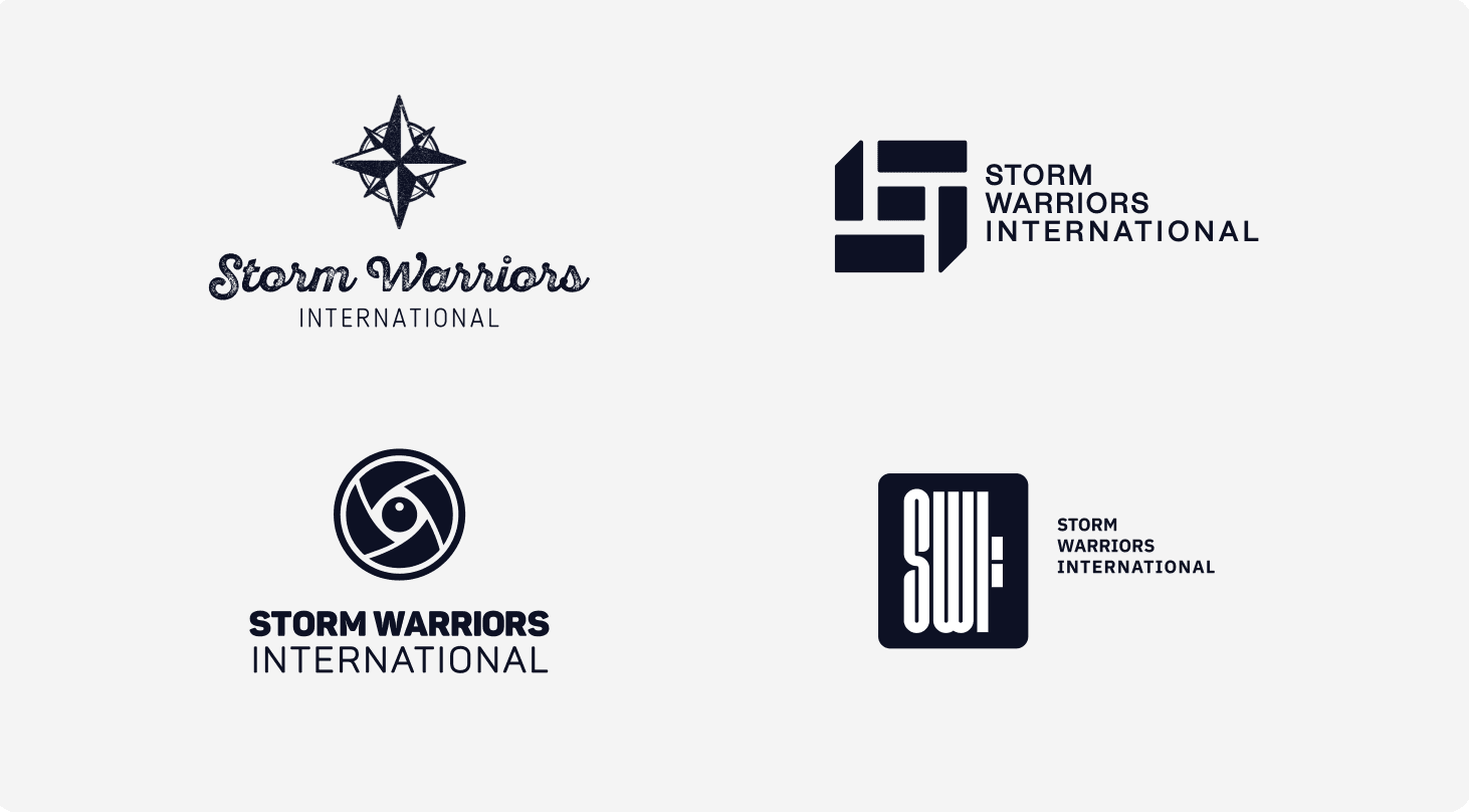
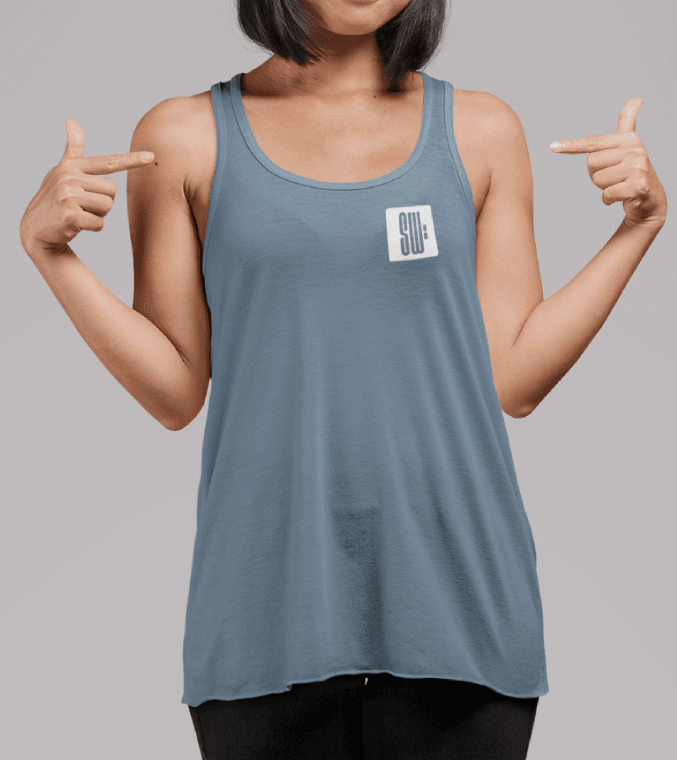
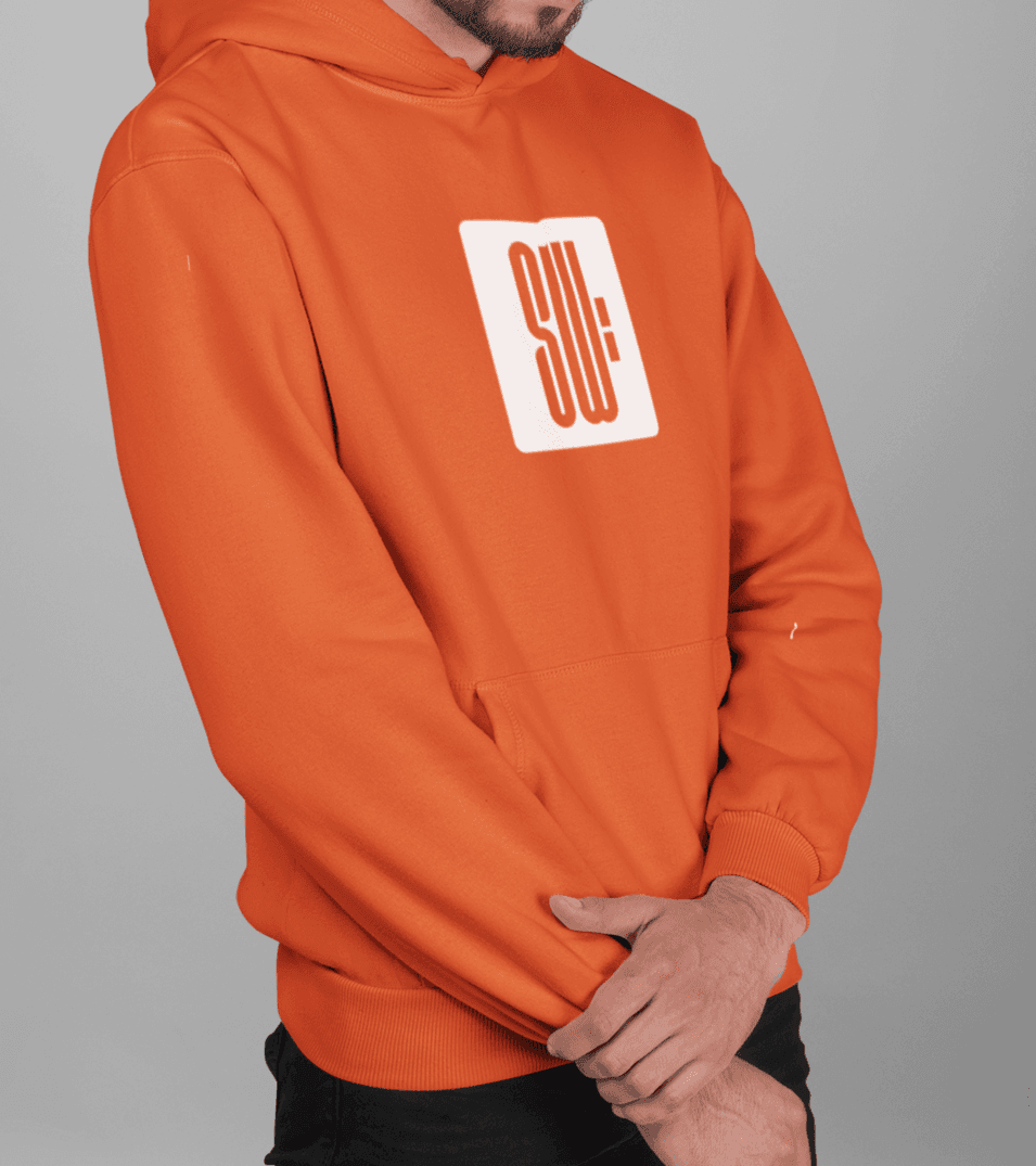
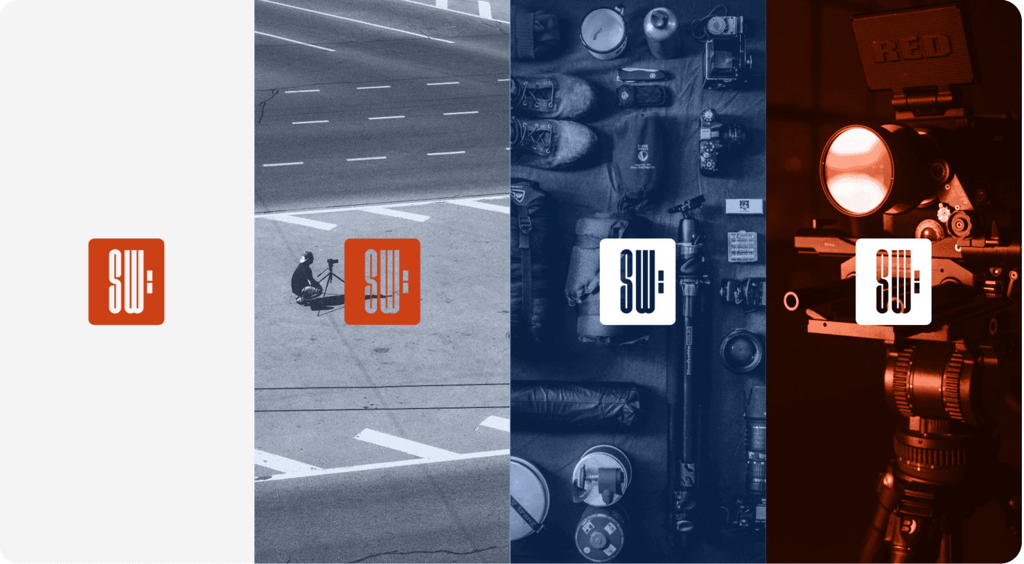
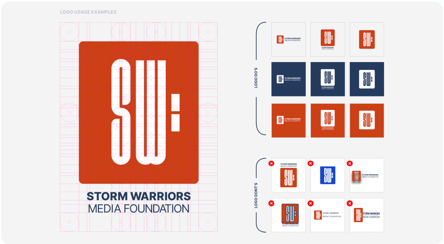
Presented with four final logo options and some solid messaging, Storm Warriors enthusiastically selected a final logo: a rounded square that holds Storm Warriors initials and a colon. Since Storm Warriors partners with multiple organizations, the idea was that the colon would give them the chance to combine logos with partners, with the colon being the separator between the two. Additionally, the colon within the box of the logo created an abstract image of a camera.

Last Minute Name Change

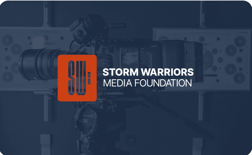
Once a final logo is selected, we send it back to the design team to tweak based on the client’s final revisions and start mocking up the branding guidelines. We ended up dropping the final initial from the logo; during the logo process, we collectively realized that part of Storm Warriors rebranding would be giving the name a small tweak to make their mission less vague and more pointed. Storm Warriors International became Storm Warriors Media Foundation.

A Splash of Color
The original branding for SW featured a bright orange rescue buoy. We used this color as our inspiration to create a cohesive and modern color palette. Pairing the vibrant orange with a darker navy created a really dynamic and theatrical feel to the brand. This bright orange color can be used to draw the users attention to important information and content, becoming an integral focal point for the brand and emphasizing the helping nature of SWMF.
Cultivating the Brand Image
Another aspect of branding is the associated images and how we treat them. We wanted to select really dynamic and cinematic imagery that captured the essence of Storm Warriors. At the heart of SWMF is the idea of being a signal flare for nonprofits in need. Utilizing imagery of the ocean (which pay homage to the beginnings and founding story of SW), we capture the user’s attention while at the same time showcasing what SWMF offers: digital media and film services.
Building the Brand
Once the logo, messaging, color palette, and typeface have been established, we create a comprehensive brand guideline for our client, which includes all the final brand assets and the “dos and don’ts” of using them. This will act as their “brand bible” going forward, and will give our client a strong foundation to launch from as they continue to expand their organization. It ensures that all their assets and communications will stay consistent and cohesive.
Let's work together to bring your vision to life.
PROJECT TEAM
Jennifer Chew
PROJECT MANAGER
Orion Alden
CREATIVE DIRECTOR
Maggie Nugent
Content Director
Hunter McPeak
DESIGNER
Alex Brown
Developer
Meet Side•Sea
We love when an organization has a strong backstory. It gives us a really solid jumping-off point and a little bit of freedom to play around with turning that story into an aesthetic. We had fun combining the nautical and media themes of SWMF's brand. It ended up creating a perfect recipe for a really strong, cinematic vibe that is super compelling and engaging.
Orion Alden
CREATIVE DIRECTOR
Dive into Storm Warriors
Visit Site
Let’s talk!
See how we can elevate the
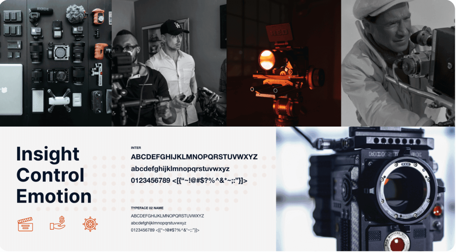
voice of your brand.