Unitec • Business
Powering New York’s Biggest Buildings
There’s no New York City without elevators. side • sea and our partner agency e9digital came together to design a modern, informative website for one of New York’s biggest elevator maintenance and management companies.
Web Design
HERE’S THE LOWDOWN
The Unitec Elevator site was another collaborative effort, this time with our regular New York-based partner, e9digital, and first-time partner Curzon Marketing. Curzon is a marketing agency in the U.K. that was able to provide us with clear user profiles for our audience, which in turn helped guide our design work; we knew our users would be high-income, young, and ambitious property managers and contractors. With this information, side • sea and e9digital set out to start the design process.
Starting in the Sky
We presented the client with two initial concepts to gauge their design preference. In this first concept, we highlighted the beauty of New York and created a scrolling experience inspired by a ride in an elevator. The user starts at the top of a skyscraper, overlooking the city’s skyline, and as they scroll, visual components break up the elevator’s journey to the ground floor. The header typography and logo represent the frosted glass of a skyscraper window.
The Winning Concept
Concept 2 focused on a clean, sophisticated, and modern user experience. We took inspiration from Unitec’s logo, making it the cornerstone of our aesthetic by taking the rounded edges of the “U” and using it to frame our imagery. The overall design is welcoming and professional. After looking at the two concepts, our client chose this direction.
Finding Our Palette

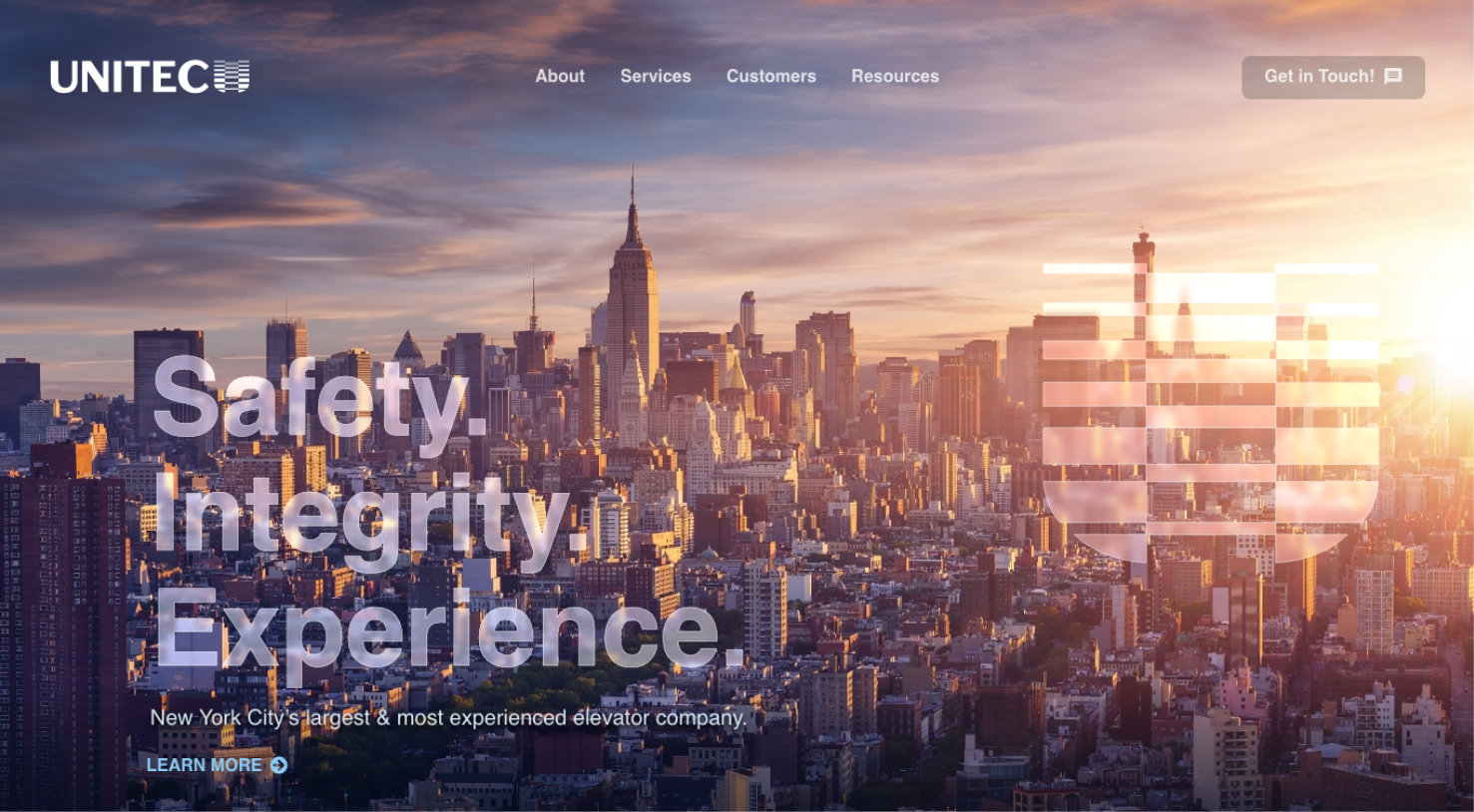
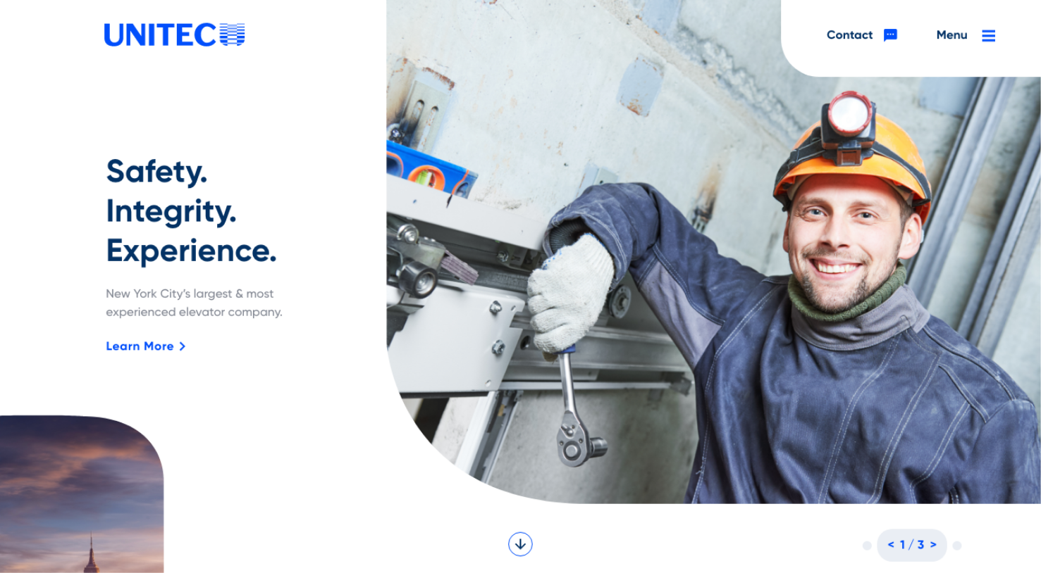
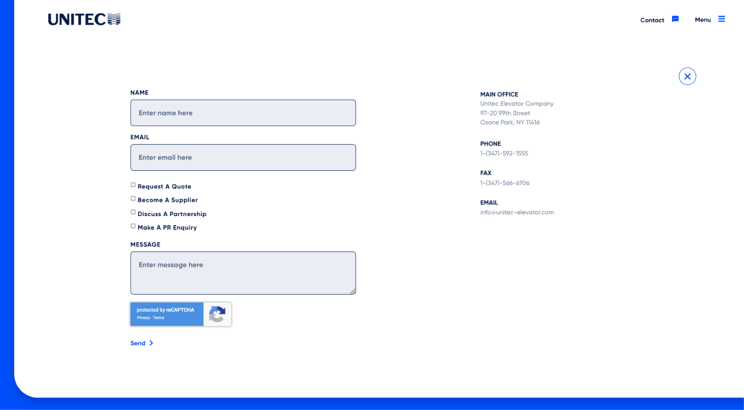
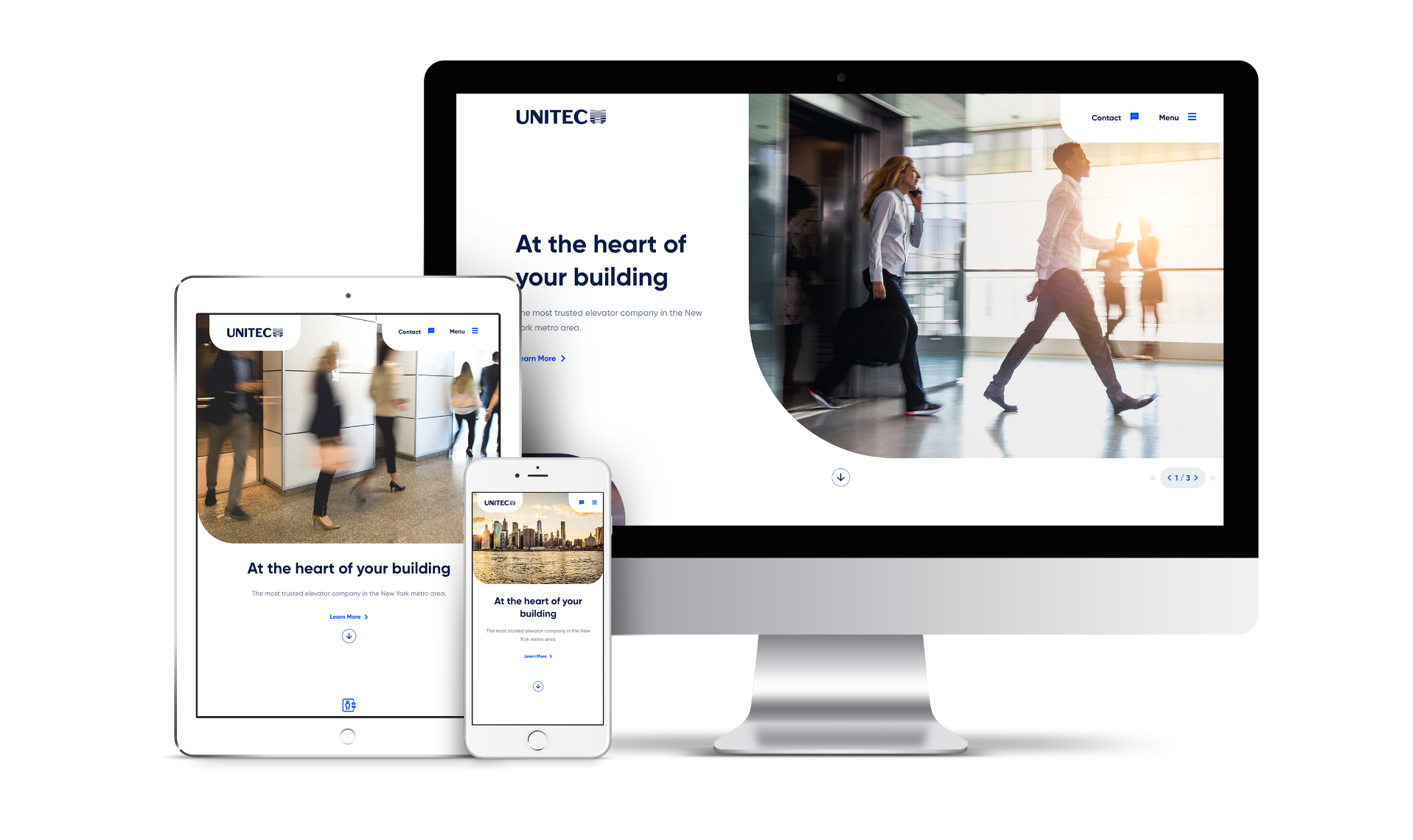
When we establish color palettes, we like to think about the psychology of color. Blue is one of the world’s most well-loved colors, bringing feelings of calm, serenity, and trust. We used a bright royal blue as the base of the palette, pairing it with white to establish that clean, professional feeling. We added in a darker navy for text, the footer, and certain overlays to create variety and cohesion.

A Simple Call to Action

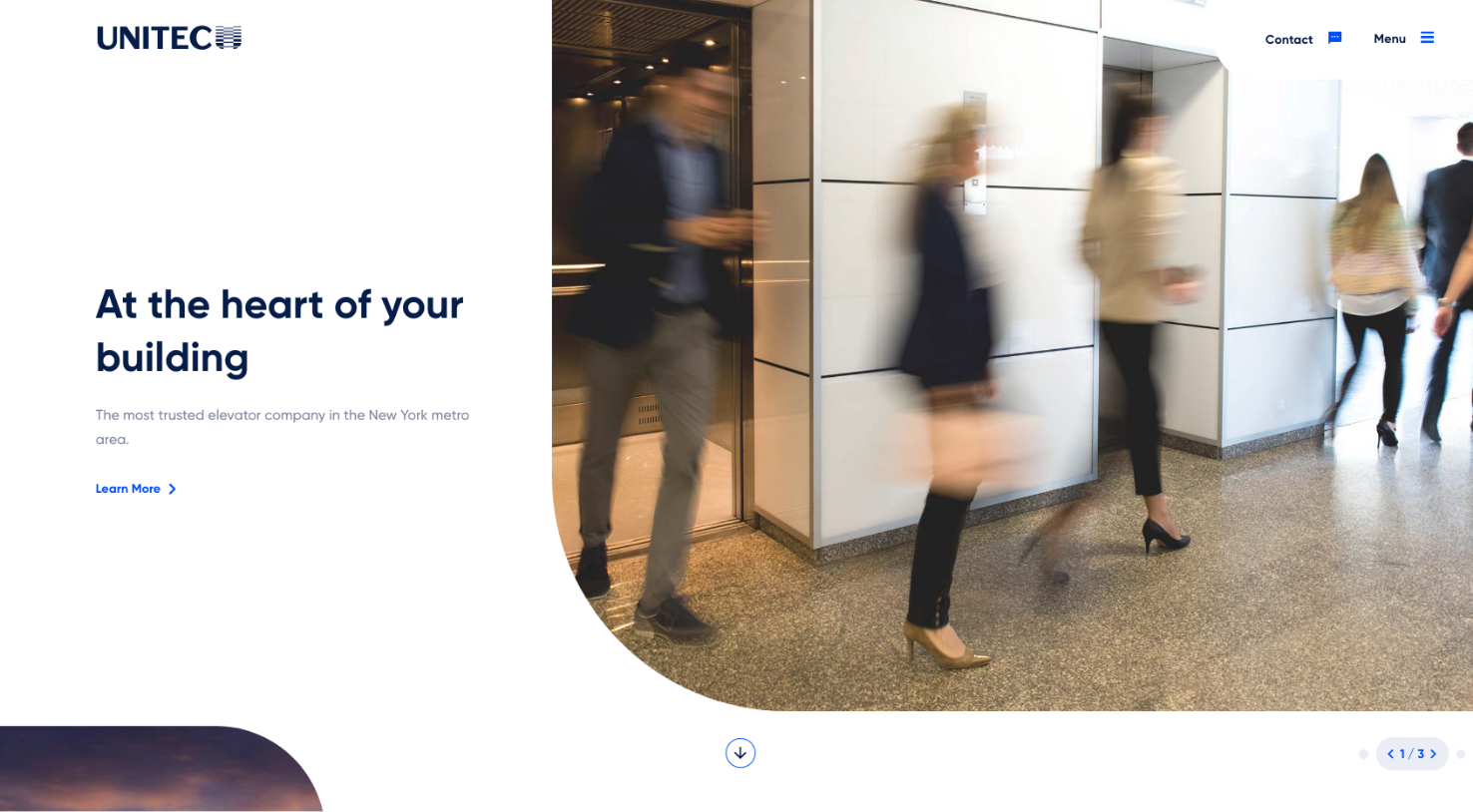
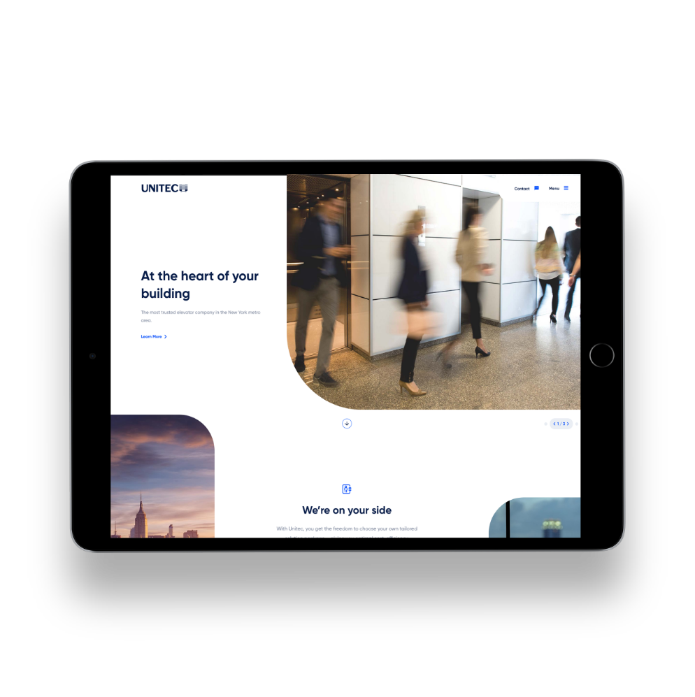
We wanted to set Unitec apart from other elevator sites out there, so we decided to play with our header and navigation and create something a little more unique. We used that “U” shape from the logo to frame both the logo and the calls to action at the top of the page. This made for a clean, simple header that reduced the critical calls to action down to two options — contact and menu.

Everything, with a Single Click
When the user clicks the “Contact” CTA, a robust contact form immediately drops down from the top of the page, allowing the user to fill it out on the spot rather than redirecting them to an interior page. The menu next to the “Contact” CTA operates similarly -- a single click opens up a large menu showing the entire sitemap in a navigable, orderly fashion.
The Importance of Elevators
Picking the right imagery was an important part of creating the right visual aesthetic for the site. While our first round of design featured images of workers repairing elevators, we took those out in the second round and replaced them with more compelling images of fast-paced office life in New York. Rather than focus on the somewhat unglamorous side of elevator repair, we take a step back and instead focused on the integral role elevators play in one of the most bustling cities in the world.
Designing for Scale
We created a scalable system for Unitec to speak to their customers, the primary focus being Residential and Commercial clients. A secondary navigation bar allows the user to take a deeper dive into either of those service areas, and it also allows Unitect to add to these service areas as they scale their business. As they develop new services, they simply add it to the secondary navigation and create a new interior to house that content.
Let's work together to bring your vision to life.
PROJECT TEAM
Orion Alden
CREATIVE DIRECTOR
Hunter McPeak
DESIGNER
Ben Blodgett
Technical Lead
Meet Side•Sea
When we think of elevator repair and management, it doesn’t feel like the most glamorous topic. But when you take a step back, you realize how fundamental they are to the success of the city. We tapped into this idea, putting emphasis on the architecture and enormity of New York city, and how this critical feat of engineering makes it all possible.
Orion Alden
Creative Director, side • sea
Ready to Explore the Finished Product?
Visit Site
Let’s talk!
See how we can elevate the
voice of your brand.