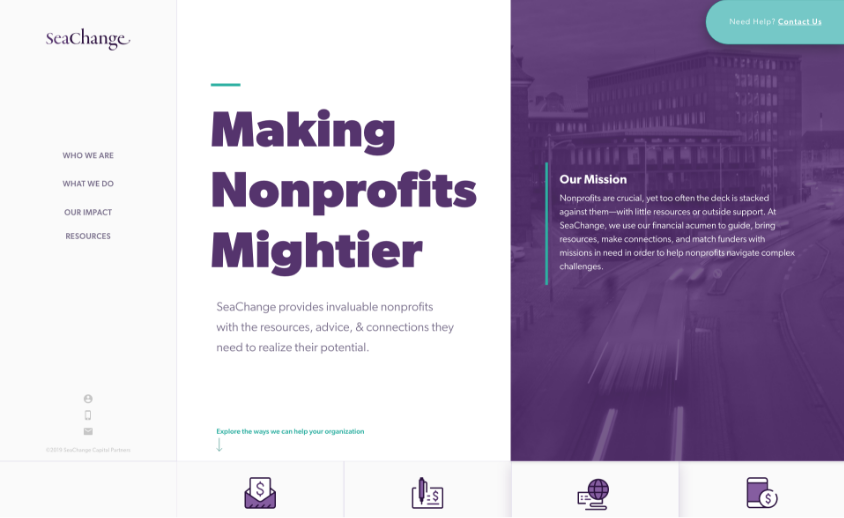
Presenting Two Distinct Options
SeaChange opted for us to start by presenting them with two very different homepage concepts for them to choose between. The first concept we presented utilized a side-navigation and a very clean and professional look, with more white space and a limited color palette.
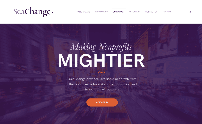
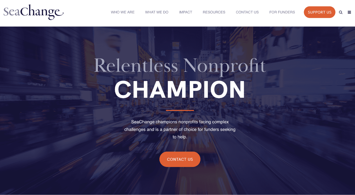
The Winning Choice
Our second concept was a bit more vibrant and relied more on color and imagery than the first. It used a standard top-navigation, and we used that color and imagery to create a design that really resonated movement and progress. The client chose this concept.
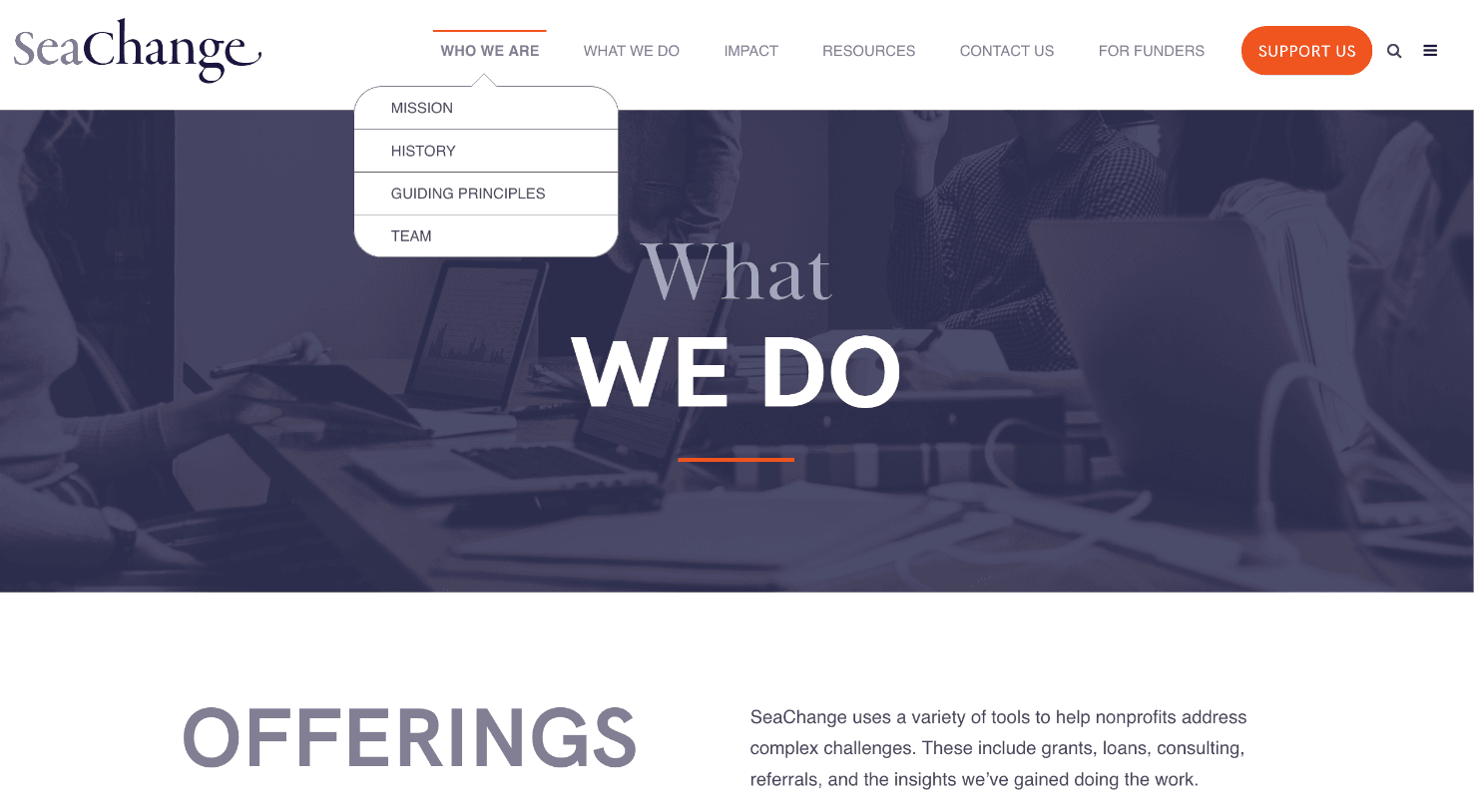
A User Friendly Architecture
Creating a user-friendly information architecture was an important part of this project. The website speaks to two different audiences: nonprofits that need funding, and investors who are interested in providing those funds. We wanted to make sure that users could get to the information they needed to have a successful visit to the website. This meant a comprehensive navigation and a user experience that included jumping-in points to all the critical pages throughout the site.
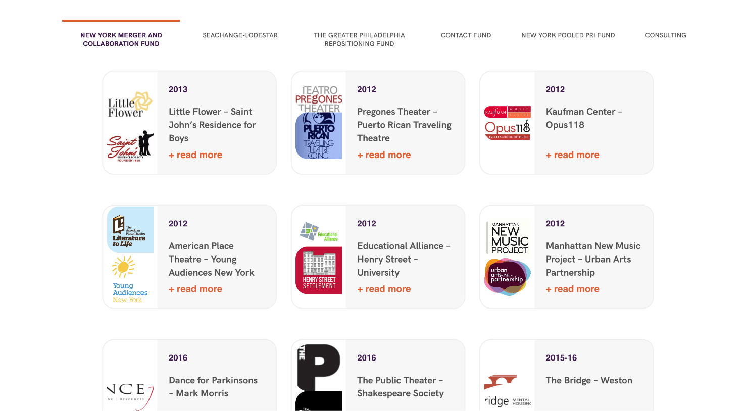
Creating an Impact Portfolio
SeaChange has helped a ton of nonprofit organizations with funding and wanted to reflect that work on their impact page. We created a grid in which users can filter through projects depending on which SeaChange “fund” was associated with said project. Each one of these little portfolio cards expands to reveal more information.
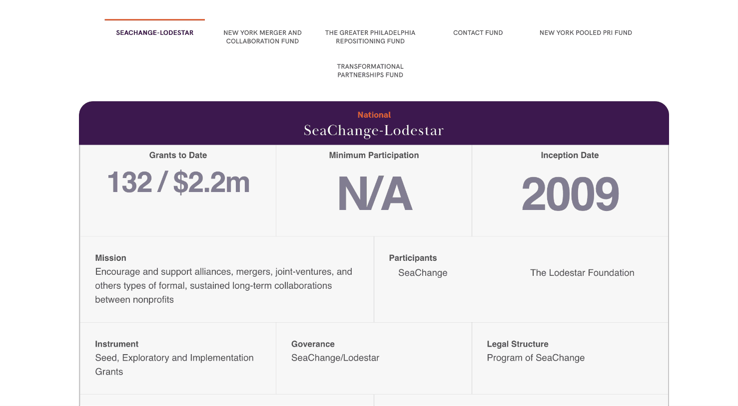
Browse By Fund
SeaChange helps nonprofits using six different funds, each one with certain qualifications and purposes. We designed this cool, functional chart that allows users to browse through each of the funds and all the different information pertaining to each. When you click on a particular fund, all the information in the boxes changes to match that fund.
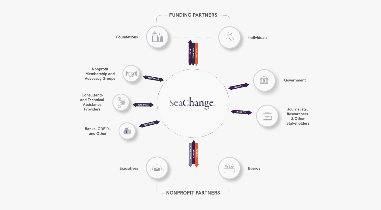
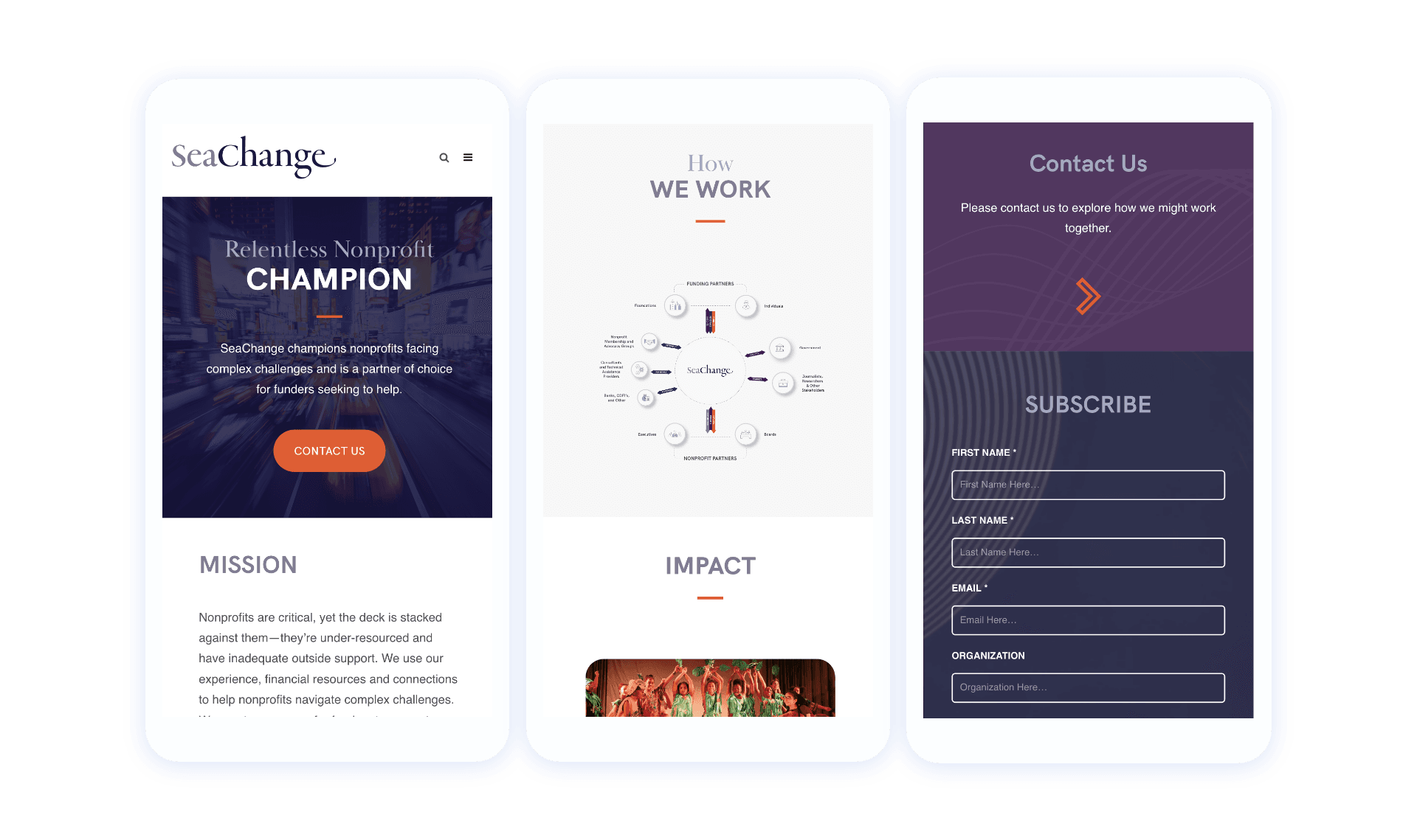
From Free-Hand to Digital
SeaChange wanted a visual that could illustrate the different avenues through which they can aid nonprofits. They put their thoughts on paper as a hand-drawn sketch, and our design team turned it into this comprehensive, branded diagram that illustrates all the key partners and stakeholders and their roles within the SeaChange ecosystem.
Let's work together to bring your vision to life.
PROJECT TEAM
Orion Alden
CREATIVE DIRECTOR
Hunter McPeak
DESIGNER
Maggie Nugent
Content Director
Jennifer Chew
PROJECT MANAGER
Steve Stromick
Developer

The imagery and design flourishes we used throughout the site really represented movement and motion to reflect SeaChange's commitment to helping nonprofits grow and progress. I love how vibrant and alive the pages feel, while still conveying some really important information. We always want design and content to complement and elevate the other.
Orion Alden
Creative Director
Explore the Finished Project
Visit Site

Let’s talk!
See how we can elevate the
voice of your brand.
voice of your brand.